Tuesday, December 30, 2008

Gary's Performance

Click chart to enlarge
Gary the chimp is doing a lot better than we are. He's up 5.2% as of the close today, compared with a loss of 8.0% for the S&P500 index. It's been 2 months since Gary chose his portfolio by throwing darts at 5 uptrending charts and 5 downtrending charts. Over the same time period, Buffett's Berkshire Hathaway is down 19.4%, Icahn's MOT is down 18.6%, Kerkorian's MGM is down 26.1%, and Adelson's LVS is down 63%.
Gary's performance continues to improve as time goes by because more and more of his charts are showing their true colors. The beginning was rocky for his portfolio, as many of the stocks were bought at short term inopportune times. But now with two months of momentum, Gary's underlying thesis that an object in motion remains in motion is being proven correct.
If we can prove (in real time) this simple concept on a little blog like this, then the burning question is why don't the pros know this? Buffett bought GS at 120 or so, and GE at 25. Gary would have shorted both of those charts.
Speaking of GS, it looks as if it is breaking through the top of its ascending triangle, which bodes well for the market as a whole.
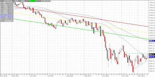
We'll have to see how long Gary continues to outperform the market. His approach likely has a shelf life, as no chart goes in one direction for too long without reversing. The chart above is of EBS, one of Gary's longs. Even though his performance is impressive (leaving his more intelligent human peers in the dust), it must be understood that his performance will always be better relative to the market during bad times. In good times, Gary will still profit, but will underperform the market. He is most likely to make about 1% to 2% a month over the long run, regardless of what the indexes do. His approach is well suited for those who chose to accept a somewhat muted return during bull markets in return for far less anxious times during bear markets. We're hoping Gary can continue to maintain his current 2.5% monthly profit, which would give him a 30% yearly gain. It sounds too ambitious, considering this would mean his account would triple in value every 3 years.
Regardless of whether he makes 10% or 30% a year, your money would be far safer invested with this chimp than with Bernard Madoff. In a nutshell, this one statement sums up the reality of Wall Street, the scam that is the backbone of our financial system. Last we heard, Madoff may get the most severe punishment the SEC can give him... a very hard slap on the wrist accompanied by a $75 fine. He may also have to apologize to those he scammed. Surely this severe treatment will send a message to future scammers and make Wall Street a safer place for our grandchildren to invest their life savings.

Thursday, December 18, 2008

Nasdaq

Click chart to enlarge
The chart above is a chart of the Nasdaq, but it may as well be any of the indexes. Today's action was just noise. The indexes are still within their ascending triangles. Nothing has broken down yet. It is no suprise that they are struggling in here considering that traders have two reasons to sell the rallies (50dma and horizontal resistance). We always like when triangles form because they force the market to chose a direction quickly. We expect a decisive move to take place very shortly, ending the respite from volatility we've had over the past month.
We hope that move is lower, as we'd like to get rid of QID and SMN and load up on the Ultralongs now that the market is trading more rationally. Unfortunately, the next move is likely to the upside. Ascending triangles have a tendency to break to the upside, and after all, the market is still very oversold on an intermediate term basis.
Purely from a technical standpoint, we're not suprised to see oil carving out new lows every day. That's what downtrending charts do, hence our call for 14 cent oil. From every other aspect, though, we are shocked to see how weak it is. Even the recent 1,000 point rally in the Dow has not given oil a breather. Despite how much it has fallen, we continue to warn that there is absolutely nothing redeeming about its chart. It remains in freefall, much to the relief of those who cannot heat purely with wood come January and February.
As for the other commodity related stocks, despite recent strength, they all remain in downtrends. This is the strongest they've been since breaking down in July/August, but they are by no means in an uptrend. If you pull up a weekly chart of any of the fertilizer stocks and put a 100dma on it, you'll see that they are nowhere near being in an uptrend. You need to see the big picture without getting caught up in the day-to-day noise in order to appreciate how little their recent strength means in the whole scheme of things.

Wednesday, December 17, 2008

50 dma

Click chart to enlarge
The above chart of the Dow shows that we've broken through the first milestone, the 50dma. As mentioned in the previous post, our guess is that we'll be hitting resistance at November's highs at the same time we're hitting the 100dma. This resistance level will likely give the market a very hard time. Staying within a wide trading range between 8,000 and 10,000 is our prediction for all of 2009.

Wednesday, December 10, 2008

S&P 500

Click chart to enlarge
The chart above of SPY (S&P500) shows the 50dma (blue), 100dma (orange), and the 200dma (red). Back in the dotcom crash, every time the market returned to the averages after a significant selloff, there was widespread talk of a new bull market. People raced to buy stocks because the sentiment was that the market had sold off in error. Watching the financial news would make you want to sell your house and put everything into stocks. And each time this happened, it wasn't long before the market turned around and crashed to new lows.
It was a very frustrating time for investors. We put a rule in place at that time that we would never trust a rally below the 200dma. All action below the 200dma is typical bear market action, so there is no need to get giddy about any rallies for a very long time.
The closer we get to the averages, the more ripe the market becomes for initiating new short positions. Given the market's severly oversold condition (since its plunge in early Oct), we will keep our long bias until the market returns to at least its 100dma. At that milestone, we'll change to a net short allocation, increasing the short positions if the market continues higher towards the 200dma.
The market is currently toying with the 50dma. A significant break and close above it, if it happens, will be an important milestone for technicians everywhere. If we take out the 50dma, the next resistance is November's highs (the election rally). If the market continues to rally, there is a chance that this resistance coincides with the 100dma. In about 3 weeks, the 100dma will be roughly at November's highs of S&P 1000. If we reach it, that will be a very tough resistance to break.

Friday, December 5, 2008

Oil Prices

Click chart to enlarge
Ever since they made a decisive and simultaneous break of both their trend channel and moving averages on July 17th, oil prices have been locked in a Stage 4 decline with no end in sight. Today, Merrill Lynch came out with a $25 oil prediction, an additional 40% drop from its current price of $43 per barrel.
On Oct 2, Merrill cut their oil forecast from $107 to $90
On Nov 26, Merrill cut their oil forecast from $90 to $50
So, why, then, didn't they just call for $25 oil on October 2nd? Or on July 17th for that matter?
We called for commodities to reach 14 cents, because we figured it's as good a guess as anyone else's. The CEO of Gulf oil, Joe Petrowski, says that oil could fall so low that it costs just $1 per gallon at the pumps. We're with him in that we're not willing to choose an artifical bottom on a downtrending chart. The bottom is always $0.
Merrill Lynch should have known this on July 17th, rather than change their forecast on a monthly basis based on momentum under the guise of advanced fundamental analysis.
Of course, it's a whole lot easier to sell investment advice based on sound fundamental analysis, particularly if the jargon used is not understood by the masses.
There is no fundamental analysis required to tell you that an object in motion stays in motion until bankruptcy, or an equal and opposite force (decisive and simultaneous break of downtrending channel and moving average) turns it around. We're not going to turn bullish on oil until this happens. Until then, we continue to predict that all commodities reach 14 cents per share.

Thursday, December 4, 2008

Agrium (AGU)

Click chart to enlarge
We're sticking with SMN given the weakness that still remains in the commodity charts. There is no bottom in sight for OIL, nor for some of the fertilizer charts like POT (at new lows today).
The descending triangle drawn on the chart of AGU above shows why we think all commodities have yet to see their lows. The odds of this chart breaking down are very high.
....
As a side note, we mentioned strength in biotech in the previous post. Perhaps we weren't clear in saying that we do not think the biotech and pharmaceutical ETF's are a buy yet. They are all stage 4 downtrending charts. We were just happy to find a small pocket of strength anywhere in this market, and felt it deserved to be recognized. The only way to play it is to buy one of those great-looking individual stocks on a pullback to the moving average or other substantial weakness. Even then, it's a risky bet, as they are small cap names with light volume. A single earnings report can cut them in half, uptrend or not. As a general rule, we never buy biotech or airlines. Both are extremely thankless businesses which spend the majority of their time on the brink of bankruptcy.

Wednesday, December 3, 2008

Biotech

Click chart to enlarge
The chart above is the chart of Emergent Biosolutions (EBS). Normally we would think nothing of a single stock with a nice chart in this market, but this one isn't acting alone. It is among a group of smallcap biotech stocks enjoying their own little bull market. Others in the space include QCOR, CBST, and OSIR. It's exciting to find a pocket of strength like this in a market where it's difficult to find even one good chart. It shows that there is light at the end of the tunnel.
We figured that if there is strength in a sector, perhaps its ETF would also have a strong chart. Unfortunately, this wasn't the case. The biotech ETF charts (BBH,FBT,IBB,PBE,XBI) do not look bullish yet. Nor do the charts of the pharmacuetical ETF's (IHE,IXJ,PJP,PPH,XPH). Nevertheless, pockets of strength like this are the first step in turning a sector around, which of course is the first step in turning the market around.
....
It is our feeling that based on the amount of time the market has been bearish without respite, we are soon due for a very formidable rally. Our time frame is longer than many on this board, as we have developed incredible patience for this game. When we say that we're due for a substantial rally, we're looking at the big picture. At some point over the next several months, we're looking for a rally that takes the market over 10,000. Anyone with a retirement account and a long time frame would likely be doing the right thing by buying into the indexes (in layers) on weakness. We just don't see the market as having much more downside below 7,500.
That's not to say there isn't money to be made on the short side. A return to 7,500 before the rally begins is entirely possible. Once we reach 10,000, we fully expect the market to lose a few thousand points again. We just aren't buying Dow 5,000 considering that all of the government's bailouts and rate cuts will start taking affect shortly. Stock prices will reflect the benefits of these actions 6 months ahead.
....
A note on GS's earnings: We think the risk/reward ratio on their report is such that there is more downside than upside. They're a government-supported company with inside information that the SEC turns a blind eye to. They're playing poker with a full view of everyone's cards. So, of course, they are expected to do reasonably well. The upside is therefore minimal. If they disappoint, however, the market will be very shocked.

Monday, December 1, 2008

Fertilizers


Click charts to enlarge
Of course there are many ways to play the short side of the market. Short financials may be the best bet (SKF), but not to be discounted are the recent descending triangles playing out on the charts of the fertilizer stocks. These triangles are not perfect, but the charts are bearish nevertheless. The chart of POT (top chart) looks like it's heading for a break of recent lows. The chart of MOS below it is only slightly stronger. Most of the other fertilizer stocks paint a similar picture. TNH is the least bearish of the group, but we're confident that if POT makes new lows, it will take the entire sector down with it.
Despite a rally in SMN (Ultrashort materials) today, we bought some near the close. It accounts for about 4.5% of our portfolio, but we'll add more if these stocks get to a point that they're just hovering precariously over their old lows. The chart of the sector's leader, POT, is simply too bearish for us not to act on it.